Mesa AZ 928.499.3352
Custom Website Design & Development
Responsive
Web Design
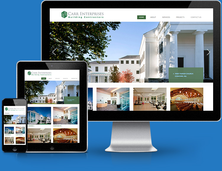
Your site needs to look great and function perfectly whether your customer is viewing it on a desktop computer, a tablet, or a smartphone.
Our responsive design approach ensures that customers can view and interact with your site from any device, and your business will always looks good.
How does responsive design work?
From Wikipedia (source):
Responsive web design (RWD) is a web design approach aimed at crafting sites to provide an optimal viewing experience—easy reading and navigation with a minimum of resizing, panning, and scrolling—across a wide range of devices (from desktop computer monitors to mobile phones).
A site designed with RWD adapts the layout to the viewing environment by using fluid, proportion-based grids, flexible images, and CSS3 media queries, an extension of the @media rule.
Explained:
Unlike a mobile specific website a responsive website uses the same content for all devices and monitor sizes, from desktop computers to mobile phones. Viewing a traditional "fixed width" website on a mobile phone usually requires zooming in, resizing, etc.
A responsive design adjusts the layout of the content on the page as the width of the browser window changes, eliminating the need to manually zoom in on the content. Other changes can be made to target specific browser window sizes to make the usability even better, such as adding a mobile specific navigation, removing certain page items, etc.
See how we combine great design and functionality in custom responsive sites.